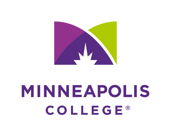
Minneapolis College has an Updated Logo
In 2018, the College launched its comprehensive brand identity system, with a new brand platform, look, and logo. Now, five years later, the logo has been further updated for clarity and consistency. The logo/name “Minneapolis College” will be used for branding purposes, while the full name “Minneapolis Community and Technical College” will be reserved for formal/legal purposes.
The updated Minneapolis College logo retains the design values developed during the original brand launch—elegance, simplicity, flexibility, and scalability. Also unchanged is the original logo’s unique and memorably stylized M.
The M mark’s lines represent the multiple paths to education offered by the College, as well as the layout of its campus walkways. The colors were chosen to represent wisdom, ambition, renewal, and life. The spire that is centered at the bottom of the mark symbolizes the spark of creativity, with its five points representing the Minneapolis College values—student-centered, inclusion, community, excellence, and integrity. The spire also symbolizes the guidance provided by the College, evoking education as a beacon for success.
Consistency in brand and logo means cohesive, unified messaging for audiences. Such consistency helps build trust and credibility with customers and stakeholders, and it helps ensure that the Minneapolis College brand is both memorable and instantly recognizable. Logomark, colors, typography, and photography are all brand system building blocks. Brand guidelines ensure that all marketing, from website to social media posts, uses these building blocks consistently.
Transition to the revised logo begins May 15 as new collateral is needed and signage is updated. For questions, contact Associate Vice President of Marketing and Communication Kathy Rumpza. Employees can submit a project request using the marketing project request form.
Minneapolis College’s trademarks are registered with the U.S. Patent and Trademark Office.
